Vuca.li
Turned a brand book into eight development-ready pages in nine days
The brand I was handed
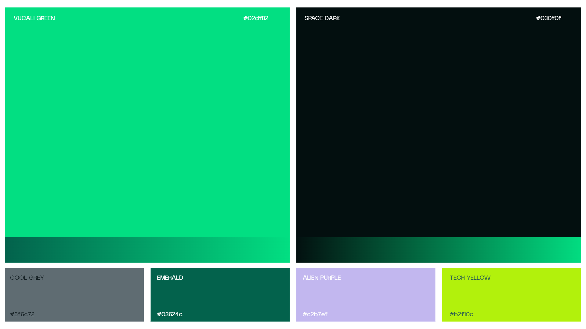
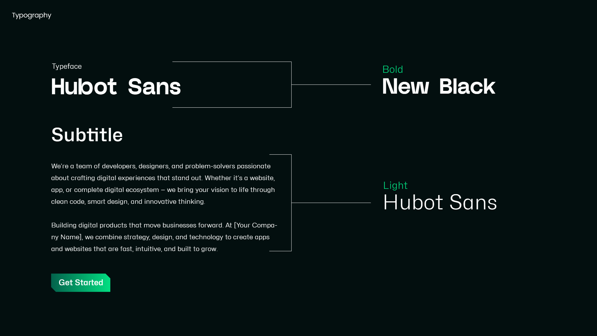
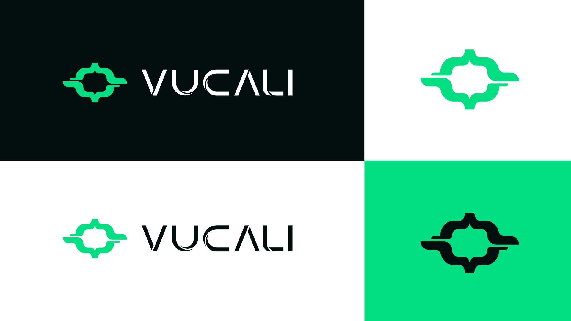
Vuca.li builds software. It came with a finished identity: a logo drawn from a pair of code braces, a green that burns against near-black, and the typeface Hubot Sans. The direction for the site was a single line asking for futuristic sci-fi, more like a galaxy. With it came a sitemap of eight pages, a company profile and three sites the client liked.
What I was brought in for
To make that identity into a website, with every page on the sitemap ready for their developer. The brief arrived on a Monday, and the client closed the project on the Tuesday of the following week.
An identity is drawn for a logo and a business card. Here it had to carry eight pages, with forms, filters and motion.
Direction came one line at a time, in Figma comments. When a comment asked me to make the CEO message better, I asked what better meant.
The pages went to the developer on the ninth day. The preloader came after, when the client asked for one, and I animated it in Figma.
I sent two directions and three questions to choose by.
Both come from the same brand book. The three questions were green or neutral, rounded or sharp, and which sections to take from each. The client took the first, and I designed the other pages in it.
I built the motion into the components.
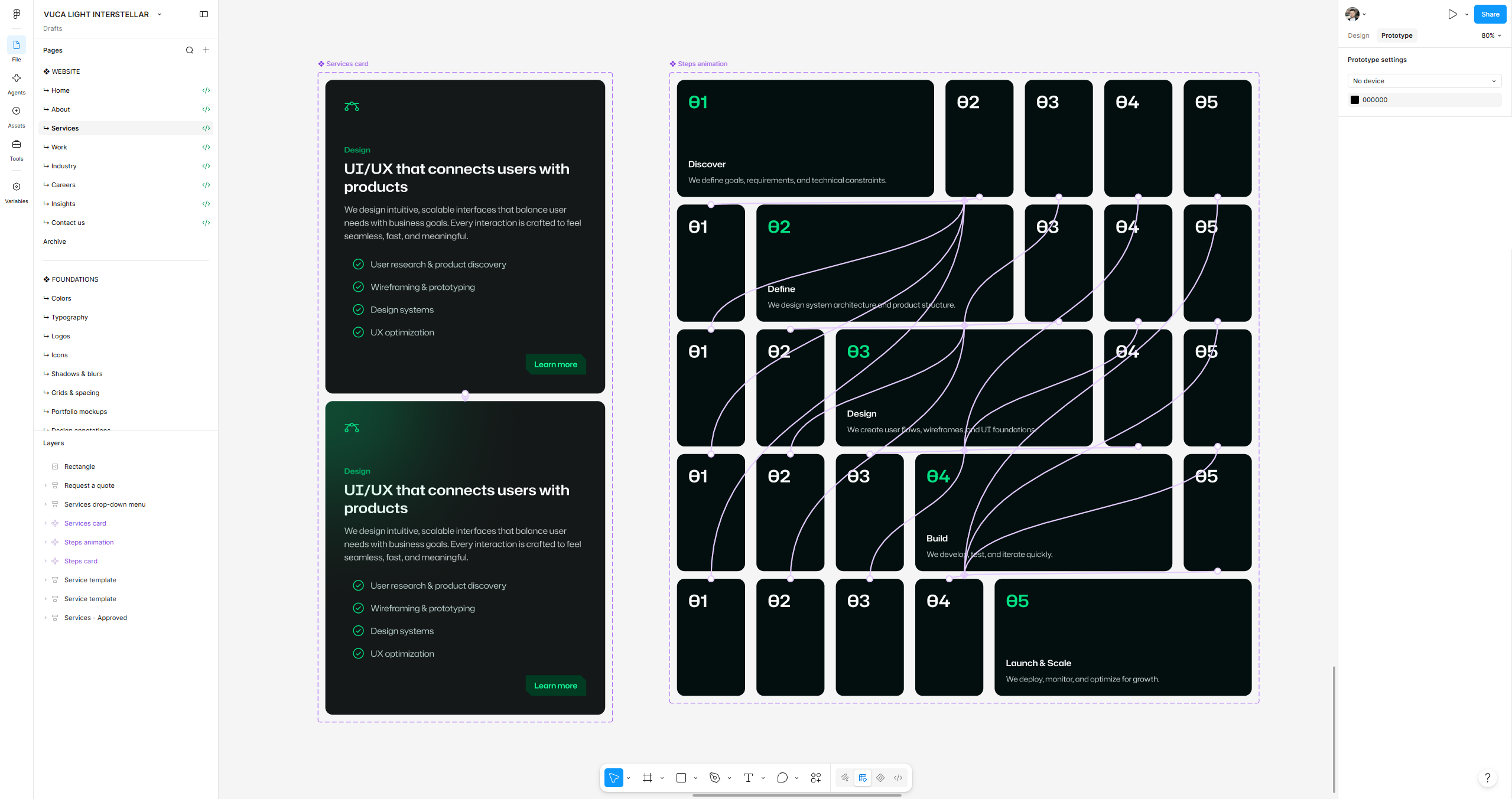
The service card and the process block carry their own motion. Hovered, the card lights up, and a closed step opens on a click. Both use smart animate, 0.3 s ease-out, and both play in the opening film. I prototype components as a rule. That way I can check how each one behaves, the client can see it in a demo, and the developer gets the motion with the component.
A contact form that arrives as a brief.
Request a quote asks for what Vuca.li needs to price the job: the service, the project in the customer's own words, files and a phone number with its country code.
Eight pages, four templates.
There is one design for each kind of page: a service, an industry, an article and a case study, so the site grows by content, not by new design. The client asked for one template for every service, and the industries follow the same rule.
open for contract and freelance work, remote. write and tell me what the problem is.