AO Med
Replaced the paper casualty card that combat medics fill in during an evacuation
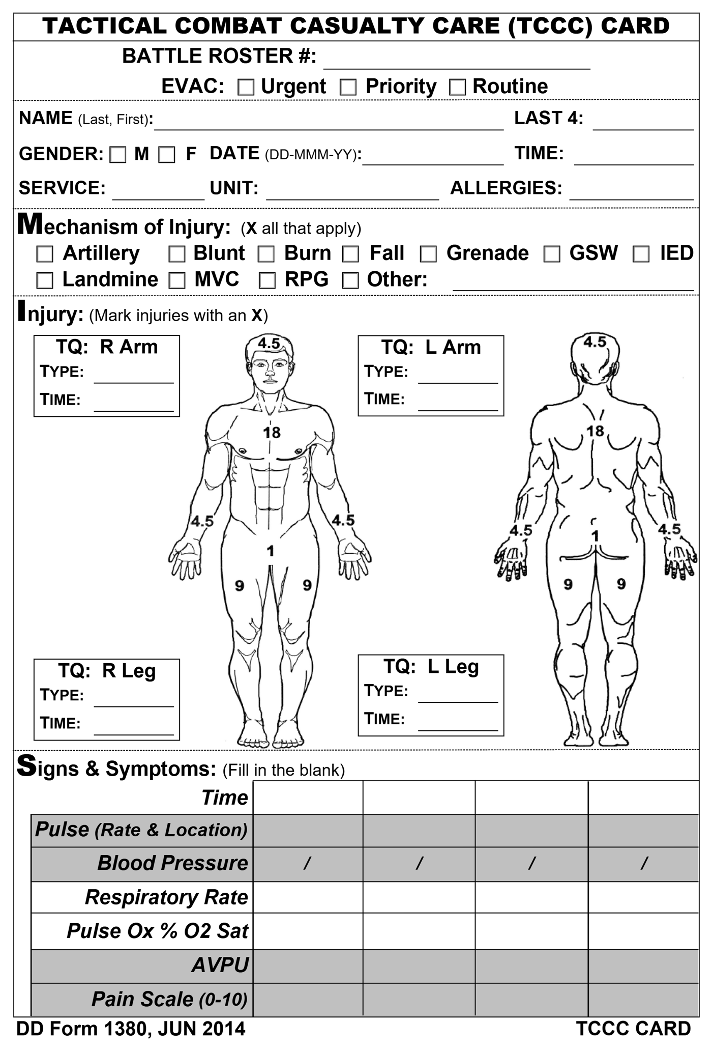
The card it replaces
Every casualty in a combat evacuation gets a TCCC card, short for Tactical Combat Casualty Care. It records injuries, vital signs over time, treatments and drugs, on paper that travels with the patient. A medic fills it in while treating someone, with little attention to spare for a form.
What I was brought in for
AO Med, a volunteer medical project in Ukraine, had a working tablet prototype built without a designer. Starting from it, I designed the app in Figma for the developers: the digital card and a live patient roster. I also proposed changes to how it should work. Some went in straight away. Where the client decided otherwise, the reason is shown below.
Most decisions here came from one question: will it still work for a medic whose attention is on the patient, at any hour and in any light?
The tablet software is finished and running. Version 1.0 was built in December 2025, and Zebra, the tablet’s maker, demonstrated it to the Ministries of Health of Poland and Ukraine. In the client’s words, the interface is a hybrid of my design and some last-minute tweaks on their side.
The next things I would measure are how long a card takes to fill in and how often a tap misses under real conditions.
I kept the big buttons and dropped the dialog on top.
The client wanted big buttons in a dialog over the card, easier to press in gloves. That is unusual on a tablet, hides the card being filled in and adds a tap. I opened the same buttons in place, inside the form. The client agreed.
A green status, and the medic moves on. I wanted the numbers to warn too.
I wanted the failing number coloured too, so the reason arrives with the alarm. The client refused, because medics would start trusting the machine over their own reading. The field takes the colour, and the figures stay white.
I drew a dark theme for night work. The client kept the original colours.
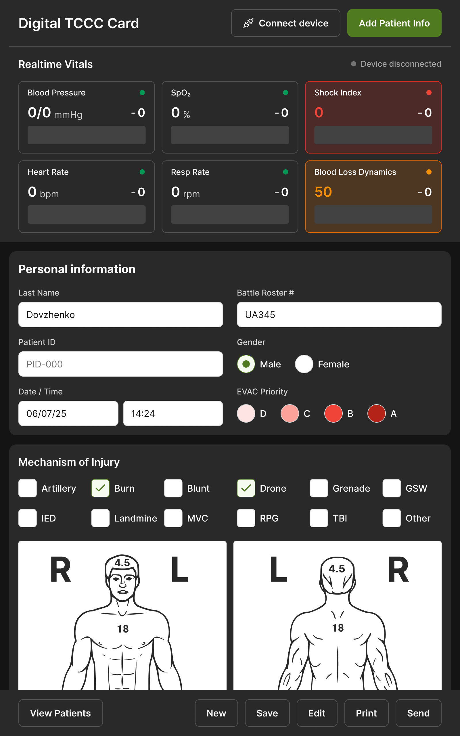
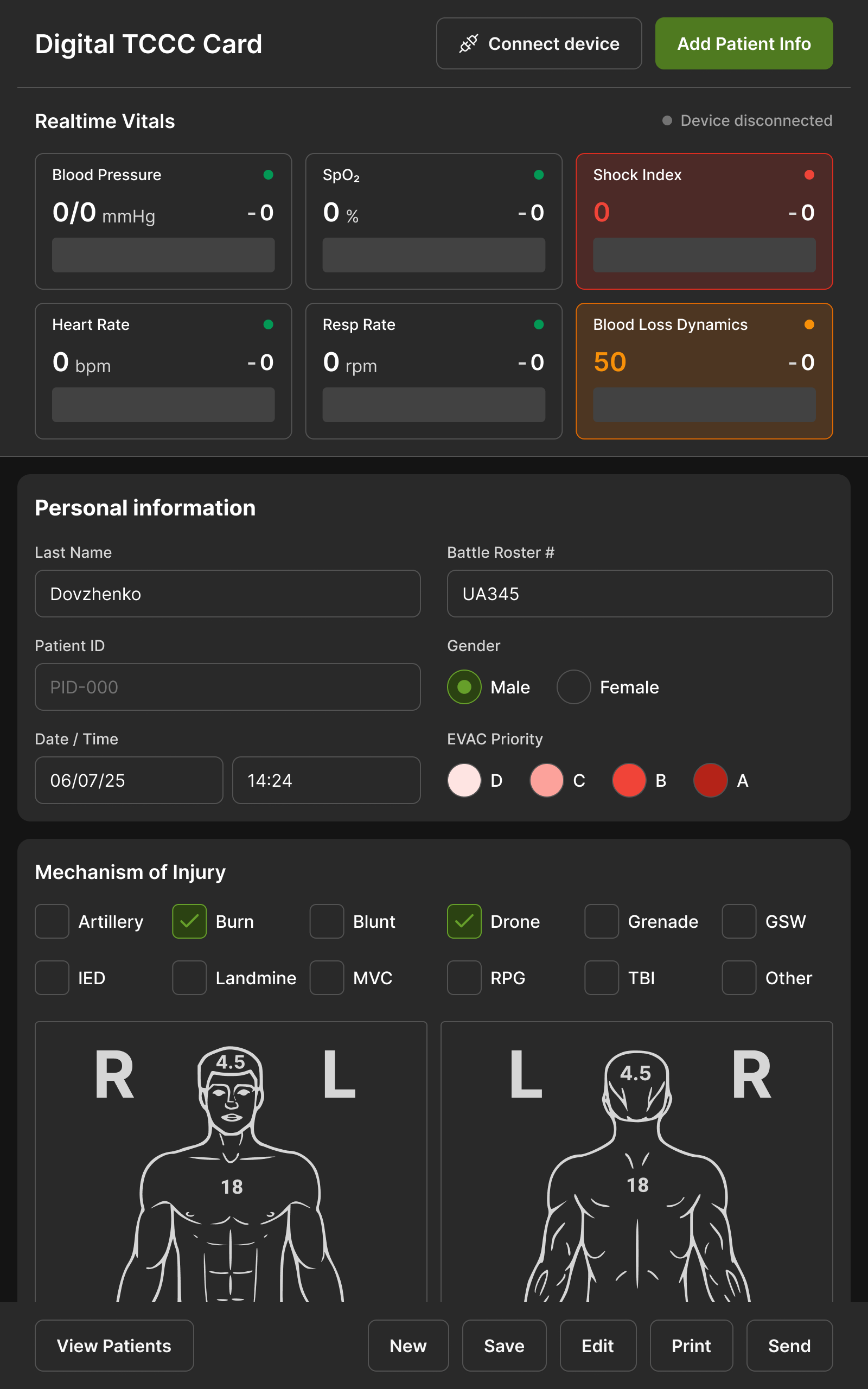
Nobody had raised it: white input fields hurt the eyes at night. I drew a full dark theme for the dark hours, with a light one for daylight. The client liked it but kept the original colours for investors, to revisit once funded.
“What we ended up building, as a result of Oleksii's relentless questioning, was a much better system than we had initially envisaged, and once we started testing the tablet software with combat medics in Europe and Ukraine, what we found was that having taken the extra time to incorporate Oleksii's design thinking really paid off.”
open for contract and freelance work, remote. write and tell me what the problem is.